
July 26, 2012
Version the Second
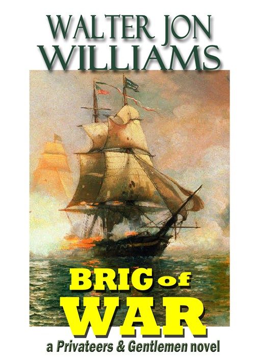
Right, here’s an alternate version of the Brig of War cover.
The main objections to Version the First were the green and orange type— the orange in particular, I’m guessing— and the various highlights and shadows I added to the typeface.
The green and orange were the same shades used in the art— I was hoping to harmonize the colors. I hoped the orange would reflect the gunfire and pick up the reddish tinge of the clouds.
The highlights and shadows were necessary to make the type visible, particularly when it’s shrunk down to postage-stamp size, which is how most people will see it.
A bright color being necessary to make the title stand out against the dark ocean, I’ve now changed the orange to yellow, and I now have the title overlapping the edge of the artwork— leaping, as it were, toward the reader. The brighter color doesn’t need the highlights the orange required, but it still needs a dark shadow to set it off.
So . . . which do you prefer?
Reader responses
Comments
Be the first to respond.